GEOMETRY & CONTRASTS
Geometry and contrasts are two powerful tools employed in Cartier's style that focus on both forms and patterns. This play of symmetry and asymmetry, parallelism and perspective, as well as the strength of intense colour contrasts, create powerful combinations pioneered by Cartier.
GEOMETRY: PLAY OF SHAPES


CHROMATIC CONTRASTS

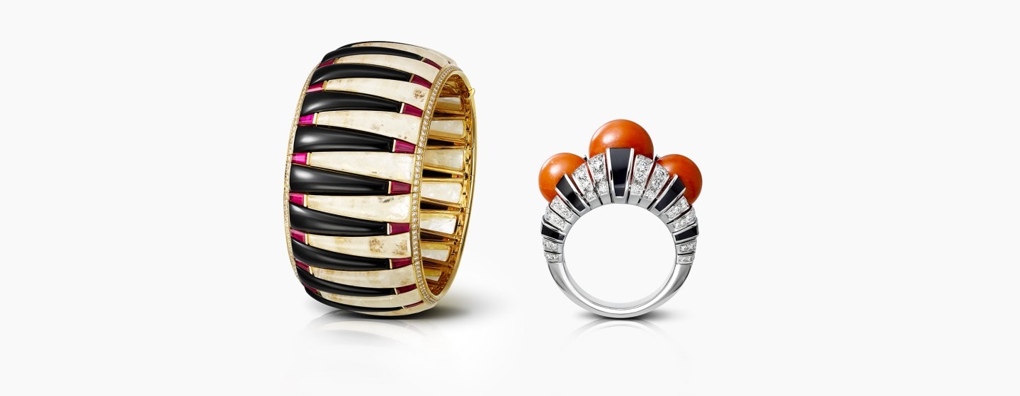
The pairing of red and black is interpreted in a wide range of shades: sunny hues of coral, luminous hues of rubellite or intense hues of ruby. The black of onyx or lacquer highlights its contours and volumes, and draws shadow-like effects while inducing a rhythm.

Since it first appeared in the 1910s, the combination of green and black became more popular as the Maison began to research the purity of forms and the simplicity of design. Onyx pushes boundaries, emphasises, gives relief, and showcases its depth to the point of becoming a recurrent element of the Art Deco era.
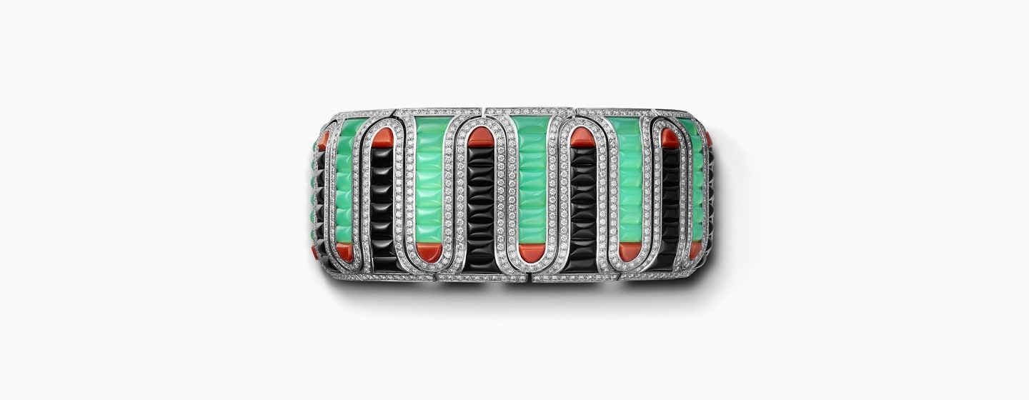
The combination of green and red is common in Cartier's repertoire: emerald or jade are often combined with coral or ruby. For contrast, the Maison adds black onyx, lacquer or enamel to underline the geometric patterns and to create a play on perspective.

The combination of green and red is common in Cartier's repertoire: emerald or jade are often combined with coral or ruby. For contrast, the Maison adds black onyx, lacquer or enamel to underline the geometric patterns and to create a play on perspective.

The combination of green and red is common in Cartier's repertoire: emerald or jade are often combined with coral or ruby. For contrast, the Maison adds black onyx, lacquer or enamel to underline the geometric patterns and to create a play on perspective.

The combination of green and red is common in Cartier's repertoire: emerald or jade are often combined with coral or ruby. For contrast, the Maison adds black onyx, lacquer or enamel to underline the geometric patterns and to create a play on perspective.
- 1
- 2
- 3
- 4

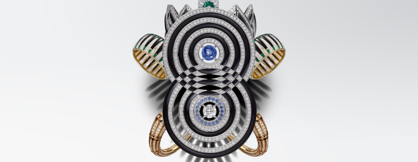
Carrying the pioneering spirit of the Maison even further, Louis Cartier introduced the combination of blue and green, colours that had always been deemed incompatible. What he called his “peacock motif” is now a signature colour of the Maison.

Cartier has added many other, often unprecedented, colour combinations to the most emblematic ones. In the 1930s under the impetus of Jeanne Toussaint, the Creative Director at the time, jewellery pieces mixed fine precious stones together without any distinction. Amethyst, aquamarine, citrine, and peridot took their place beside diamonds, rubies, sapphires, and emeralds. This taste for confrontation in terms of materials stands as one of the Maison’s stylistic signatures.